Marcel Yuwono 13 July 2020
What's Stylometry?
Stylometry is the of analysing of literature and written language. It most commonly used to establish authorship of texts, among other applications. Stylometry has existed in different forms even before computers. Today, stylometry is usually done by machine learning models. In industry, stylometric models are trained to do things such as sentiment analysis, to allow companies to classify things such as product reviews as "positive" or "negative."
But not all stylometry is done by machine learning. More basic algorithms exist that can tell us a lot about an authorship and their work. Let's take a look.
Word Frequency Analysis
Word frequency analysis has existed way before computers. The premise is simple, to identify a text, we tabulate the number of times a unique word appears in the text. If we divide by the number of words in the text, we get the proportion of times that word will appear in the text. By comparing the frequency distribution of different texts, we can make calculations on how closely they relate.
However, visualizing the data isn't as easy as it seems. If we have 1000 unique words to calculate the frequencies of, we need 1000 dimensions to visualize each point. Think of each text as a variable that holds N attributes (each unique word) that need need to be plotted. If we only graph two unique words, we can plot the x-value to be the relative frequency of the first word and the y-value as the relative frequency of the other word. With, three words, we just add another dimension. But at 4 words, 5 words, 1000 words—well you see the problem.
Principal Component Analysis (the solution!)
The idea behind PCA is exactly the solution to our problem. With some linear algebra magic, we can project n-dimensional points in space into smaller and smaller dimensions. It does this by calculating best fit lines and their orthogonal components which become the "principal components." Next, we make the PC components as the axis of the new space, then project all the points in the space onto the PCs, thereby transforming our points to a lower-dimension space.
You can read more about PCA here. All you really need to know is that we can use PCA to turn our 1000-components dataset into one with only 2 components, PC1 and PC2—so that we can plot the data in 2-dimensions.
The Federalist Papers
The Federalist Papers are often used to test out different stylometric models. The Federalist Papers is composed of 85 articles, and were written by Hamilton, Madison and John Jay. We know who wrote most of the articles, but the authorship of some are disputed. Hamilton, in his death claimed that 63 of the articles were his. But Madison later asserted that 12 of the papers Hamilton said he wrote were in fact written by Madison himself.
Let's apply our word frequency analysis and PCA to find some answers. Here's the dataset, courtesy of The Programming Historian: link. The Programming Historian is an incredible learning resource, check them out here.
To process the data, we strip punctuations from each text. Then, we read the text files line by line and start counting words. This allows us to create a frequency distribution of each chapter. Then we calculate the frequency distribution (FD) for all the chapters, creating a combined FD, and grab the top 1000 most frequent words. Next we map the FDs of each chapter onto the combined FD. It's a little hard to explain, here's what it looks like:
| # | the | of | to | ... |
|---|---|---|---|---|
| Ch. 1 | 81.64 | 65.07 | 44.19 | ... |
| Ch. 2 | 63.94 | 49.14 | 31.37 | ... |
| Ch. 3 | 64.62 | 42.17 | 38.09 | ... |
| ... | ... | ... | ... | ... |
The values are exaggerated by a factor of 1000 for readability. The above table tells us that the frequency of the word "the" in chapter 1 is 81.64 per thousand words, and so on for the other values. Already, we can see that the second and the third chapter seem closer to each other than they are to the first chapter. In fact, Alexander Hamilton wrote the first chapter and John Jay wrote chapters two and three.
Next, we interpret the above table as a matrix, then feed it to the PCA algorithm to bring down the number of components from 1000 to two. I'm using Python and the sklearn library for PCA, and matplotlib to graph the results.
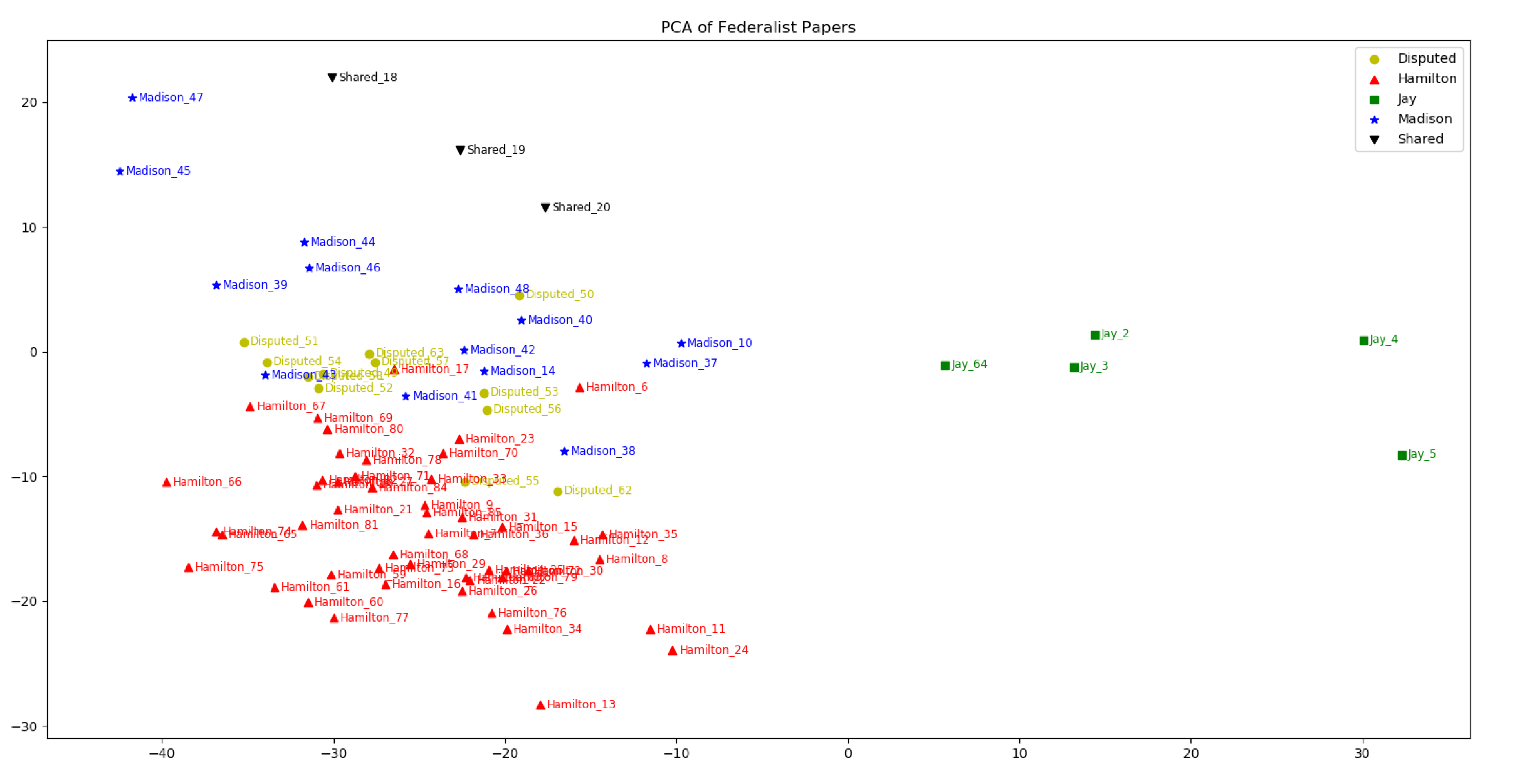
Here's what the final visualization looks like:
If the graph is difficult to see, click to open them in a new tab.
Let's remove shared articles and articles by John Jay to see the data clearer:
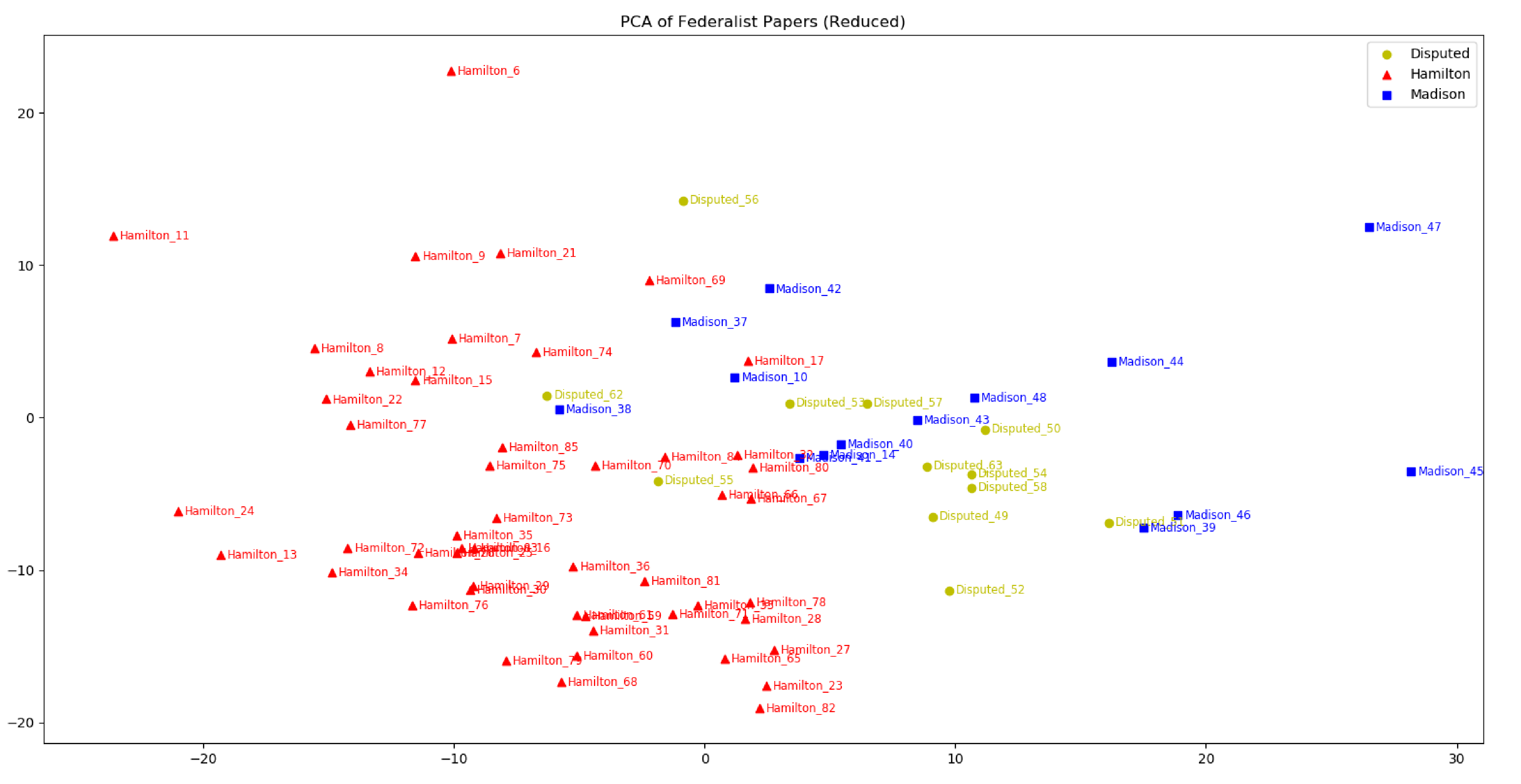
We see a very clear clustering between chapters of the same author, and the visualization suggests that most of the disputed papers are likely written by Madison instead of Hamilton. Historians and scientists using other stylometric methods almost unanimously agree to this same conclusion.
Onto Twitter Politics
It took a while to get to the main idea, but here it is: can we see a similar correlation between tweets by Democratic party members and tweets by Republican party members? Here, instead of plotting individual chapters, we will plot whole twitter accounts, and see if twitter accounts with the same "author" (Democratic party vs Republican party) cluster in the visualization.
To do this, I used twitterscraper to scrape tweets from 20 Republican and 20 Democrat influencers. Most of the accounts are senators or representatives but I included some political commentators. All tweets made by each account are then merged into their own "chapter" which we use to perform the word frequency analysis.
Here's what the data looks like:
| # | the | to | and | ... |
|---|---|---|---|---|
| (R) Ben Shapiro | 46.57 | 24.80 | 21.24 | ... |
| ... | ... | ... | ... | ... |
| (D) Bernie Sanders | 46.70 | 35.50 | 33.64 | ... |
| ... | ... | ... | ... | ... |
Again, we apply PCA then graph the visualization:
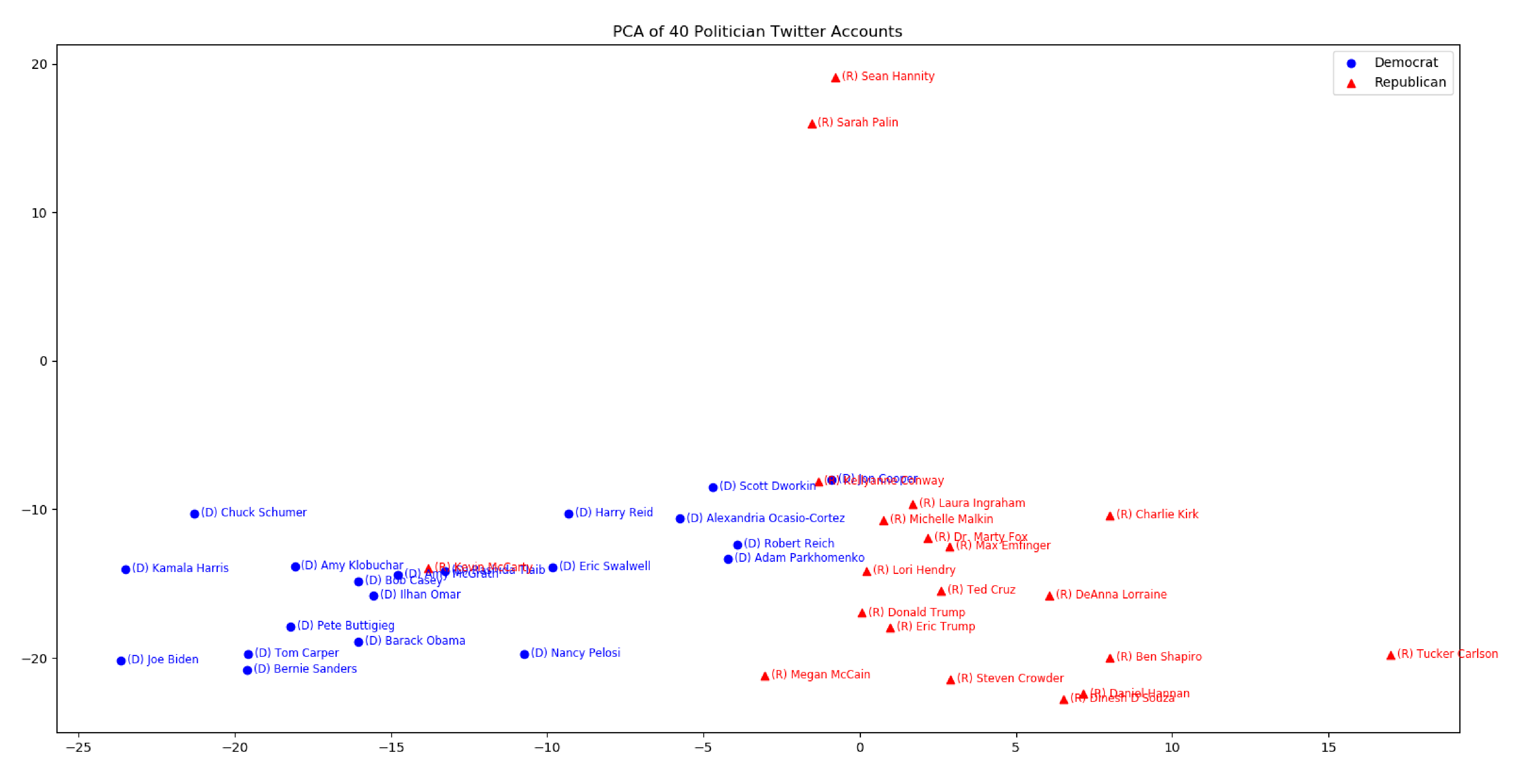
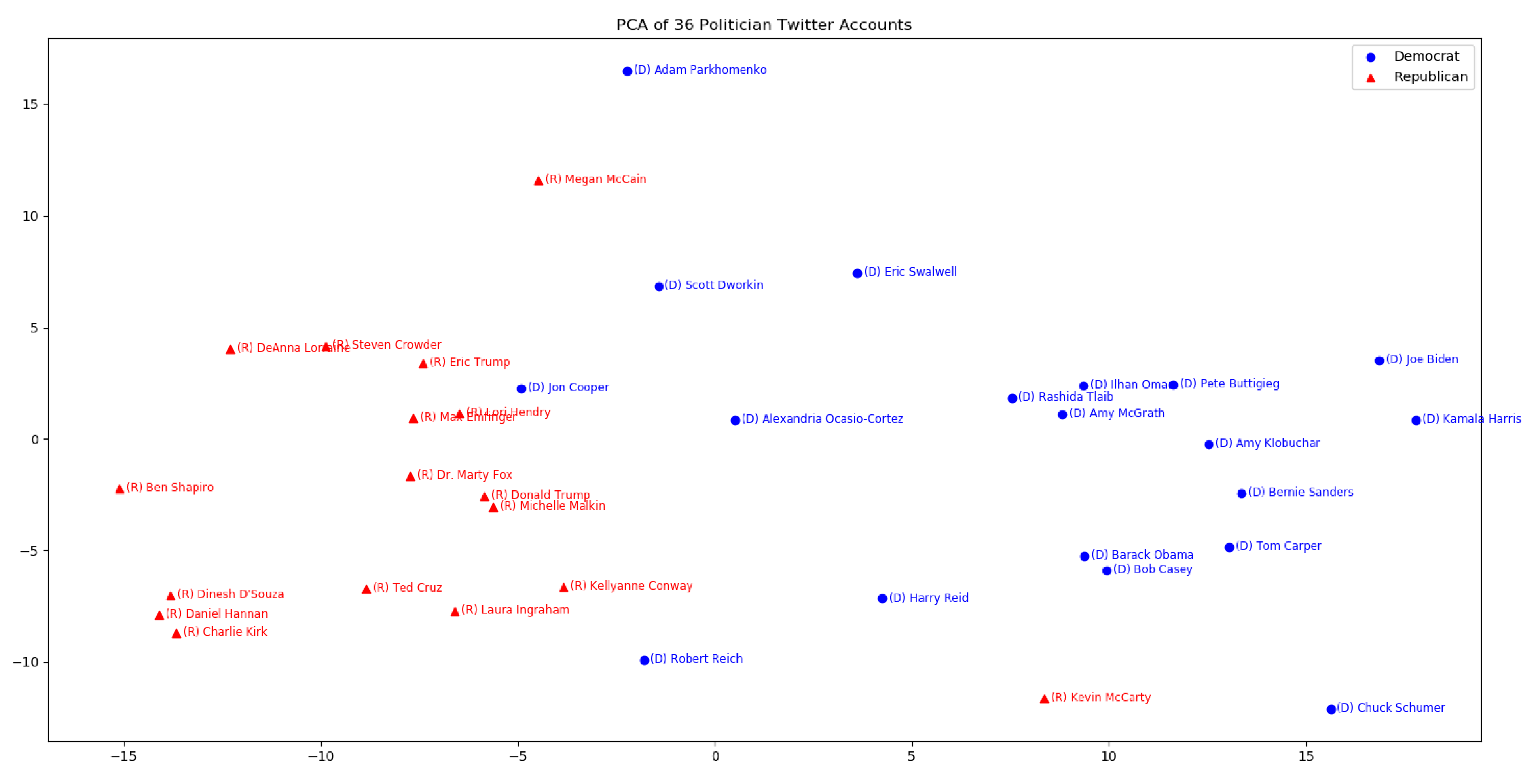
Some characters are skewing the graph very heavily. Here's the graph without Nancy Pelosi, Sarah Palin, Tucker Carlson, and Sean Hannity:
What Words Made the Difference?
Surprisingly, even though each point represents a different author, politicians in both parties cluster with each other quite heavily in the visualization.
Democrat leaders tweeted the words "health" (by 6.67x) and "trump" (1.28x) more than Republican leaders. Republican leaders used "says" 3.29 times more than their Democratic counterparts.
Surprisingly, Democrats and Republicans also differed significantly in the usage of very common words. Democrats were 1.35 times more likely to say "to" and over twice as likely to use "we." Republicans used "and" 1.17 times more than Democrats. Given the number of tweets queried, these differences are quite significant.
Final Thoughts
When a multivariate data set is projected into smaller dimensions, some information will always be lost. In my Twitter analysis, PC1 and PC2 only accounted for ~40% of the total variance. Adding PC3 and graphing the matrix in 3D will bring the accounted variance to around ~50%, which would increase the visualization's accuracy
That begin said, I was suprised by how well the two parties clustered, given that all we did was basic word frequencies. With this data, we can easily determining if a set of tweets belong to a Republican or Democrat author.
Unfortunately, word frequency analysis, although fast, is still too rudimentary. If we want to draw more complex conclusions, we would have to more complex stylometric methods, most likely involving machine learning.
Try it yourself
If you'd like to make your own visualizations, text files of the tweets and their word frequencies is available here: link.
References